Compared to the production of colors in ancient times, based as it was upon such fundamental ideas as essences and fixation, modern colours are understood by way of concepts, such as addition and subtraction, that move away from permanence and toward absolute multiplicity and variation. A History of Colours, Manlio Brusatin
Colour is a sensation not a substance
Colour Theory - What is colour theory?
It s basically having the knowledge to mix and put colours together to create your artistic piece, it is one element in the building blocks of creating an artwork. Cinematic technique encompasses colour as one of its artistic elements, and hence colour theory can be interesting and helpful in assisting one to choose colour combinations. I do believe also that colour combining is part of that area of having an eye for it as one can have an ear for music. However, it maybe as simple as paying attention to colour and its combinations, focusing on it more as an artistic idea as well as a technical consideration.
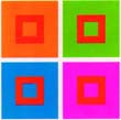
Colour Harmony - illustrations
12 tone colour wheel - Basic Model
Colour Wheels
Colour Combining - colour wheel versions and list of colour schemes
Colour Combining - List of Colour Schemes and links to some web sites that provide opportunity to test colour schemes
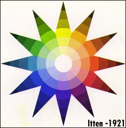
Ittens System based on CONTRAST
Music Links to Colour Wheel
Colour Theory
Colour
Harmony
Colour Wheel - Describing and Combining Colour
Colour Wheel … Colors are the children of light, and light is their mother. Light, that first phenomenon of the world, reveals to us the spirit and living soul of the world through colors." Johannes Itten,Elements of Color, 1970
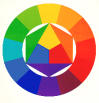
The colour wheel is a visual representation of colour theory - the colour spectrum wrapped onto a circle. Sir Isaac Newton developed the first circular diagram of colours in 1666 - more on him later. Itten's colour wheel is based on red, yellow, and blue colours as the primary triad and includes twelve hues. Several colour models have been developed for particular systems of colour use such as the mixing of opaque paint pigments, some colors are mixed light, and some are mixed transparent printing inks.
Purpose of Colour wheels To create visual combinations and
complements.
|
Primary Colours, Secondary Colours, Tertiary Colours, A Colour Wheel |


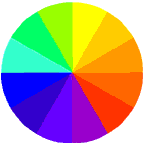
Mixing the primary colors creates the secondary colors. Red mixed with blue creates violet, red mixed with yellow creates orange, and yellow mixed with blue creates green. Mixing the primary colors with the secondary colors creates the tertiary colors; red-violet, red-orange, yellow-orange, yellow-green, blue-green, and blue viloet.
Colour Wheel - Colour Relationships
|
Traditional Colour Wheel - RGB color wheel |
 Color wheels expose relationships between colors that can
be used to achieve both balance and contrast. The wheels include a
number of full-intensity (saturated) hues as well as a variety of
tints, tones, and shades, which are less saturated versions of the
hue that include more white, gray, or black, respectively. While
combinations of pure hues create dynamic color harmonies, you can
design more subtle and subdued harmonies by using less saturated
colors that are closer in value--that is, colors with similar
degrees of lightness or darkness.
Color wheels expose relationships between colors that can
be used to achieve both balance and contrast. The wheels include a
number of full-intensity (saturated) hues as well as a variety of
tints, tones, and shades, which are less saturated versions of the
hue that include more white, gray, or black, respectively. While
combinations of pure hues create dynamic color harmonies, you can
design more subtle and subdued harmonies by using less saturated
colors that are closer in value--that is, colors with similar
degrees of lightness or darkness.
RYB - Johannes Itten (1888-1967) - Mixing Colour
Wheel
|
based on mixing primary colours - Red, Blue, Yellow, a visual representation of colour theory Focused on Contrasts between light and dark. Such as the cold warm contrast, with the red-yellow color range as warm and the blue-green range as cool |
|
Link
Link
|
|
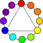
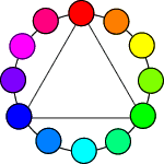
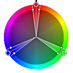
Johannes Itten - Colour Harmony
His theories reflect the relationships that he saw between
music and color. Following his theme of music and
color, Itten developed "color chords" that were analagous to
music chords. He developed a series of color harmonies, using
his twelve member colorwheel as the basis for his
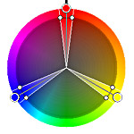
demonstrations. Any two complemenetary colors, any three colors(triads) that form an equalateral or isosceles triangle, and all four color combinations (tetrads) forming squares or rectangles are harmonious.
Harmonic Colour chords - by Johannes Itten
The geometric figures shown may be rotated anywhere in the circle, and the resulting color combinations will remain harmonious. By color harmony, Itten refers to "the craft of developing themes from systematic color relationships capable of serving as a basis for composition." In addition to his color harmonies, Itten developed a systematic approach to contrasts. His now famous Seven Contrasts include Hue Contrast, Light and Dark Contrast, Warm and Cool Contrast,Complementary Contrast, Contrast of Saturation, Simultaneous Contrast andContrast of Extension. Jump to the "Real Books" page for a listof books that elaborate on Iten, Munsell, Newton and various color topics. Colour as contrast Color against color contrast. Good Site that illustrates in particular examples of Ittens
Colour as Contrast Theories |


RGB - Frans
Gerritsen - Perceptive Colour Wheel link
|
Frans Gerritsen, a famous Dutch scientist, who does research on
colors, states in his book ‘Het femomeen licht’ (The phenomenon of
light) that white light consists of some wavelengths which can be
divided into three groups. |

By activating our eyes a little, or strongly, towards one of these 3-wave-lengths, we can see a variety of color combinations. There are three main colors when looking at the colors: blue, green, and red. Gerritsen called them the eye primary colors. In case two eye primaries are activated at the same time, the eyes secondary colors - yellow, magenta and cyan - will come into existence red + green = yellow red + blue = magenta green + blue = cyan.
 In 1975, the Dutchman J. Frans Gerritsen made a fresh
attempt at arranging colours according to the laws of colour perception.
He selected three variables — colour-hue, brightness and
saturation — and, as with the Coloroid system, organised them
within a cylinder, on the wall of which we can see an irregular wave line
formed by colour-hues arranged in a circle at their alternating higher or
lower levels of brightness. The colour-circle comprises six so-called
full-colours identified by Gerristen as yellow, red, magenta, blue, cyan
and green. He arranges them in such a way that complementary pairs lie
diametrically opposite each other, with three brighter colours alternating
with three darker colours. All conceivable primary and secondary colours
can therefore be placed both on the cylinder wall and on the wave line.
Gerritsen identifies the achromatic colours running from white via all the
grey tones to black as tertiary colours. link
In 1975, the Dutchman J. Frans Gerritsen made a fresh
attempt at arranging colours according to the laws of colour perception.
He selected three variables — colour-hue, brightness and
saturation — and, as with the Coloroid system, organised them
within a cylinder, on the wall of which we can see an irregular wave line
formed by colour-hues arranged in a circle at their alternating higher or
lower levels of brightness. The colour-circle comprises six so-called
full-colours identified by Gerristen as yellow, red, magenta, blue, cyan
and green. He arranges them in such a way that complementary pairs lie
diametrically opposite each other, with three brighter colours alternating
with three darker colours. All conceivable primary and secondary colours
can therefore be placed both on the cylinder wall and on the wave line.
Gerritsen identifies the achromatic colours running from white via all the
grey tones to black as tertiary colours. link
|
Site that provides software to try out various harmonious colour
schemes
Traditionally, artists used a color wheel composed of the primary colors red, yellow, and blue. Currently, the mixing color wheel is commonly accepted as a visual representation of color theory. This color wheel was invented by Johannes Itten, a German color and art theorist. According to Itten, the primary use of his color wheel is for mixing pigments. However, many artists use this color wheel to create visually harmonious color combinations.
|
Wolfgang von Goethe (1749-1832) - Colour and Meaning
Goethe approached the subject primarily to gain some knowledge of colours "from the point of view of art".
Goethe studied the psychological effect of colors. He classified:
Physiological Colours
Physical Colours
Chemical Colours
He was trying to distinguish between objective and subjective colours.
|
From site http://www.colorsystem.com/projekte/engl/14goee.htm
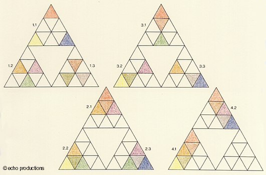
Goethe's Original Drawing Goethe proesented a circular diagram in which the
three primary colours of red, blue and
yellow alternate with the three secondary colours of
orange, violet and green. The semi-circle from
green, through yellow to red is known as the plus side; its opposite
is the minus-side Goethe referred to the part of his circle running from yellow to red as the plus side and its continuation into blue as the minus side, and arrived at the following arrangement: the yellow was associated with "effect, light, brightness, force, warmth, closeness, repulsion"; and blue with "deprivation, shadow, darkness, weakness, cold, distance, attraction". It is suggested that Goethe's intention was mainly to ascertain the "sensual-moral" effect of individual colours "on the sense of the eye ... and the eye's imparting on the mind". He understands colours mainly as "sensual qualities within the content of consciousness" and thus transfers his analysis into the area of psychology. The colours on the plus side "induce an exciting, lively, aspiring mood". Yellow has a "splendid and noble" effect, making a "warm and comfortable" impression. The colours on the minus side, however, "create an unsettled, weak and yearning feeling". Blue "gives a feeling of coldness". With his insight into the sensual-moral effect of colours, Goethe comes nearer to his initial objective: namely, to bring order to the more chaotic, aesthetic aspects of colour. He places colouration within the separate categories of "powerful", "gentle" and "radiant", and propounds the following ideas: the powerful effect will arise if yellow, yellow-red and purple predominate, with the gentle effect mainly being determined by blue and its neighbours. If "all colours are in equilibrium", an harmonious colouration will arise which can produce radiance and also pleasantness.
The first case shows the series of primary colours (1.1), secondary colours (1.2) and tertiary colours (1.3); in the second case, we give an impression of what, from the "sensual-moral" point of view, Goethe explained as force (2.1), sanguineness (2.2) or melancholy (2.3). The third case emphasises the three axes of the complementary colours: red (3.1), yellow (3.2) and blue (3.3). Finally, we accentuate brightness (4.1) and intensity (4.2). more on comparing to Newton, small extract taken here The essential complementarity of both colour theories becomes evident when we consider the role of the subject — the human being. While Goethe, as a matter of course, views the human being as central, Newton omits him totally. Here, two complementary truths meet: Goethe presents the direct truth of sensuary perception as a counterbalance to the remote truth of Newton's science; Newton distances himself from a notion of the world ("the pure human sense" as Goethe would have it). Indeed, Goethe expressively employs such a notion to obtain clarity about the nature of colours. Something troublesome arises here, creating a certain tension. The opposite of one deep truth (in this case from Newton) is not something which is wrong; it is another deep truth (that of Goethe).
|

Goethe and Colour Meaning - Linked to emotions
Good site that describes colour and meaning
http://www.color-wheel-pro.com/color-meaning.html
|
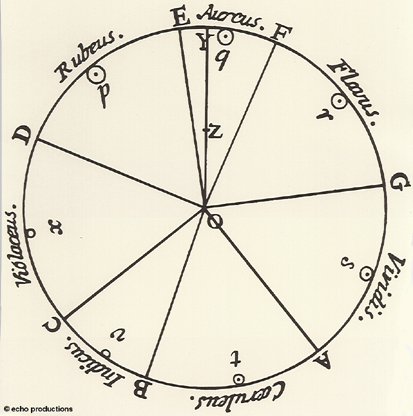
Sir Isaac Newton Link http://www.colorsystem.com/projekte/engl/08newe.htm
Let us now examine other details in Newton's colour circle. Its colours are allocated to segments, the sizes of which are proportional to their respective colour's intensity in the spectrum. Using this segment size, and the varying sizes of the light corpuscles, it was possible to calculate a type of concentration point for the circle — marked as Z by Newton — and mark it in. The straight line, which connected the white colour centre O and this centre of concentration Z, intercepted the circle at Y. ... Newton's colour circle will remain inadequately explained if we ignore its inventor's belief that the propagation of both light and sound are comparable, and that they should therefore be treated harmonically in an identical way. Newton selected his seven colours because an octave displays seven sound intervals. He allocated segments to them in accordance to their value in the Dorian musical scale. The individual sound tones associated with this scale coincide with the borders between the colour grades: D, for example, with the border between violet and red; A with the border between green and blue. This mathematical-musical appropriation of colours makes it difficult for many to understand Newton's system which, with its seven (instead of five) primary colours, has more of an aesthetic basis than a scientific one.
|
Colour Harmony
Harmony is the principle most frequently mentioned by color theorists and laymen, but probably the most misunderstood. Most people make the mistake of assuming that harmony is the only true goal of color combination. Most artists and designers nowadays would not agree. They would point out that there are few instances where colors settle down together and coordinate with ease. Moreover, too much harmony can be boring, limiting the pleasure-giving and expressive range of colors. ...
In color, as in music, if only the most harmonious elements are allowed, they must be treated in such away as to create contrast. Otherwise the result is artificial and anemic. We would be better advised to proceed from the direction of contrast. ...
http://www.noteaccess.com/Texts/Harlan/HaHarmony.htm
Color wheels expose relationships between colors that can be used to
achieve both balance and contrast. The wheels include a number of
full-intensity (saturated) hues as well as a variety of tints, tones, and
shades, which are less saturated versions of the hue that include more
white, gray, or black, respectively. While combinations of pure hues
create dynamic color harmonies, you can design more subtle and subdued
harmonies by using less saturated colors that are closer in value--that
is, colors with similar degrees of lightness or darkness.
|
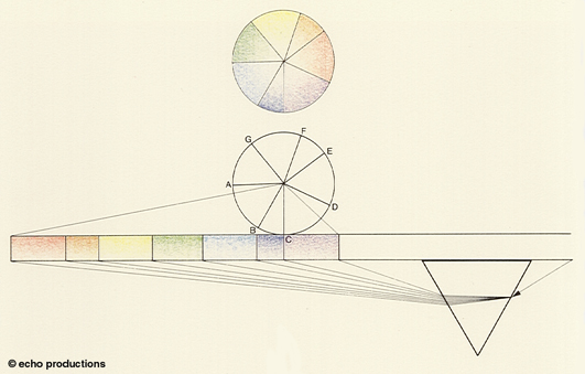
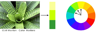
Link Like the golden rules about proportions used in the theory of forms and composition, we can also use this well in the color theory. In case you come to the point of determining how large parts of color tones in relation to each other should be, in order to become harmonized. A well known series, based on the golden rules is the relation: yellow-orange-red-green-blue-violet = 3 : 4 : 6 : 8 : 9. This guideline counts for colors with equal value, brightness and saturation. If these are different, this relationship needs lots of instinctive changing. The problem of the everyday flower arranging is how to find a good balance, the best proportion and harmony in our flower arrangement. Of course there are many different views and possibilities. Many can be good although they are totally different. The personal feeling plays a great role in this, as well by the designer as by the one who's looking. Monochrome harmonies Polychrome harmonies Color combinations of more than one color tone like the previous mentioned two-, three-, four-, and multi tones. They have a polychrome character. A refined color feeling is needed here in order to get good results. Warm and cold colors We can also talk about warm and cold colors. This has to do with our feeling. Colors can have the idea to advance or to repulsive. Warm colors are: red/magenta, orange, yellow and green. Cold colors are: blue, purple, violet, blue green, purple. Most commonly used color chords (color schemes) White; only white nuances. 2-tone When we have a combination of two color tones, which are facing each other in one circle, we call this a regular complementary two-tone (yellow - ultramarine blue). This combination will look quite strong. 3-tone When we choose 3 colors out of the circle which are on a regular distance of each other, in example cyan, green and red. 4-tone In the same way a four-tone is a harmony which is chosen often. The base for this is formed by 4 tones out of the circle, which are on a regular distance of each other; green, orange, magenta and blue. Multi-tones If we work with more different color tones we call them multi-tones. An example of such a multi-tone is a mixed mille fleur. The word mille fleur means a thousand colors. Monochromatic; ton sur ton We use one color in several nuances. Adjacent colors When colors are closely together, but not so close as by monochromatic. The colors have a relationship. |
List of Colour Schemes
Monochromatic: A single hue and a selection of tints, tones, and shades.
Analogous: Colors that are side by side or very near each other on a color wheel.
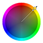
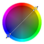
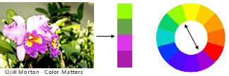
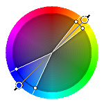
Complementary: Colors appearing across from one another on a color wheel. These color combinations offer the maximum amount of contrast but can be overstimulating if used extensively.
Split-complementary: One hue plus the two colors on either side of its complement. Split-complement harmony provides less contrast than straight complements.
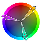
Triad: Three colors that are equidistant on a color wheel.
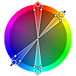
Tetrad: Two pairs of complementary colors.
When exploring color harmonies, it's often useful to begin with pure hues, then experiment with various tints, tones, and shades. You can then test the visual effect of a particular color combination by using a wireframe diagram. Remember that the importance of contrast doesn't end with designing for impact; it can also help or hinder readability.
Classic Color Schemes
Good site that goes into detail and provides softward to try out colour
schemes
http://www.color-wheel-pro.com/color-schemes.html
|
The split complementary scheme is a variation of the standard complementary scheme. It uses a color and the two colors adjacent to its complementary. This provides high contrast without the strong tension of the complementary scheme.
The triadic color scheme uses three colors equally spaced around the color wheel. This scheme is popular among artists because it offers strong visual contrast while retaining balance, and color richness. The triadic scheme is not as contrasting as the complementary scheme, but it looks more balanced and harmonious.
|
 Monochromatic Color Scheme The monochromatic color
scheme uses variations in lightness and saturation of a single
color. This scheme looks clean and elegant. Monochromatic colors go
well together, producing a soothing effect. The monochromatic scheme
is very easy on the eyes, especially with blue or green hues.
Monochromatic Color Scheme The monochromatic color
scheme uses variations in lightness and saturation of a single
color. This scheme looks clean and elegant. Monochromatic colors go
well together, producing a soothing effect. The monochromatic scheme
is very easy on the eyes, especially with blue or green hues. 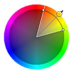
|
Describing Colour From Colour Basics http://www.worqx.com/color/color_basics.htm A colour is described in three ways:
Although all reds - pink, red, and brick are different hues distinguished by their chroma, intensity, saturation, and value. Chroma, intensity, saturation and luminance are inter-related terms and have to do with the description of a colour.
Shade and tint are terms that refer to a variation of a hue
Colour Systems Available colour systems are dependent on the medium with which a designer is working. When painting, an artist has a variety of paints to choose from, and mixed colours are achieved through the subtractive colour method. When a designer is utilizing the computer to generate digital media, colours are achieved with the additive colour method. Digital media presents some problems when attempting to reproduce compositions in a printed format. Since digital designs are generated using the RGB colour system, colours used in those designs must be part of the CMYK spectrum or they will not be reproduced with proper colour rendering. Subtractive Colour
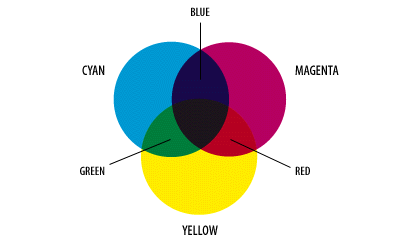
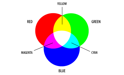
The colors red, green, and blue are classically considered the primary colors because they are fundamental to human vision. Light is perceived as white by humans when all three cone cell types are simultaneously stimulated by equal amounts of red, green, and blue light. Because the addition of these three colors yields white light, the colors red, green, and blue are termed the primary additive colors. Additive Colour
The complementary colors (cyan, yellow, and magenta) are also commonly referred to as the primary subtractive colors because each can be formed by subtracting one of the primary additives (red, green, and blue) from white light. For example, yellow light is observed when all blue light is removed from white light, magenta forms when green is removed, and cyan is produced when red is removed. The color observed by subtracting a primary color from white light results because the brain adds together the colors that are left to produce the respective complementary or subtractive color. |
|
From Adobe Technical Guides
|
|
Kodak Guide 3 properties of colour HUE, SATURATION, LIGHTNESS
|
Munsell - Dimension of color
 The human eye
is sensitive to very slight differences in color and is probably capable
of distinguishing between 8-12 million individual shades of color. Most
colors contain some proportion of all wavelengths in the visible spectrum.
What really varies from color to color is the distribution of wavelengths
in a given color. The predominant wavelength palette determines the basic
hue of the color which can be, for example, purple, teal, beige, pink or
orange. The ratio of the dominant wavelengths to other wavelengths
determines the color saturation of the sample and whether it appears pale
or deeply saturated. The intensity of the color and reflectivity of the
object being imaged determine the brightness of the color (for example,
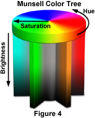
dark or light blue). This is nicely illustrated below in the Munsell Color
Tree, where each color is represented by a distinct position on the tree
(see Figure 4). Hue color value is represented by placement on the
circumference, saturation by the horizontal distance of the color from the
central axis, and brightness by the vertical position on the trunk. Link
The human eye
is sensitive to very slight differences in color and is probably capable
of distinguishing between 8-12 million individual shades of color. Most
colors contain some proportion of all wavelengths in the visible spectrum.
What really varies from color to color is the distribution of wavelengths
in a given color. The predominant wavelength palette determines the basic
hue of the color which can be, for example, purple, teal, beige, pink or
orange. The ratio of the dominant wavelengths to other wavelengths
determines the color saturation of the sample and whether it appears pale
or deeply saturated. The intensity of the color and reflectivity of the
object being imaged determine the brightness of the color (for example,
dark or light blue). This is nicely illustrated below in the Munsell Color
Tree, where each color is represented by a distinct position on the tree
(see Figure 4). Hue color value is represented by placement on the
circumference, saturation by the horizontal distance of the color from the
central axis, and brightness by the vertical position on the trunk. Link
International color dimensions are described according to Munsell: Hue = color tone. The color tone shows which color is meant: red, yellow, orange, green, etceteras. Value = brightness or dullness. The degree of tone between bright and dark stipulate the amount of light in a color. Yellow has brightness, ultramarine blue is the most somber. The following brightness, in order from bright down to sober are: yellow, cyan, magenta, green, red, ultranavblue. Chroma = saturation. When a color is powerful, it means that color is saturated. If we mix a color with white, gray of black, saturation will be weak.
http://members.cox.net/mrsparker2/intro.htm
What is Color Theory?
Basically, it's having the knowledge to mix colors and put colors together
in a way that is right for your art work. It is an Element of Art (parts
of a work of art - color, value, line, shape, form, texture and space)
that, along with the Principles of Design, help you create and talk about
art.
The human eye is an excellent judge of color in side-by-side comparisons. We can see differences that are difficult to measure especially among lighter colors. The eye comes equipped with an automatic color balance feature called "chromatic adaptation." It adjusts to overall color shifts, like those produced by different light sources.
http://www.kodak.com/US/en/digital/dlc/book3/chapter2/digColorM1_6.shtml
Color
perception is also influenced by tones and colors surrounding an image.
The color patches on the left and right are the same. Color can be defined
by three properties: hue, saturation, and lightness or brightness. When we
call an object "red," we are referring to its hue. Hue is determined by
the dominant wavelength. The saturation of a color ranges from neutral to
brilliant. The circle on the right is a more vivid red than the circle on
the left although both have the same hue. Lightness or brightness refers
to the amount of light the color reflects or transmits.
Significance of Colour - Colour and Meaning
|
The significance of color Physiological reactions The symbolism of color Common color connotations in Western cultures:
|
|
Symbolic colors From way back, mankind has used symbolic value to flowers and plants, and also to colors. In magic, color plays an important roll, as token of worship and festivities, nature played the central part. Later, as man developed society, colors needs because different and serve multiple functions. Particularly in religion, color still plays an important role. Some examples of symbolism may encourage you to study this in greater detail. It is important to remember that the meaning of symbolism can vary from country to country and their cultures. Some examples of European / Dutch color symbolism White: birth of the new moon, birth, purity Black: mourning, death, earth, seriousness Red: fight, love, passion Orange: warmth, wealth Yellow: warmth, happiness, cowardice, betrayal, hatred Green: color of spring, young life Blue: sincerity, loyalty, melancholy, heavenly Violet: seriousness, dignity Purple: power, high-ranked priest, dignity Pink: happiness, tenderness, love Gold: super-terrestrial, richness, royal power Silver: strong confidence |
Colour Theory - Colour as compositional element
Colour Models - colour wheels
Styles in use of
colour
Complimentary colours - colour harmony
Contrasting colours
Tone/Tints/Hue/Saturation
Links
color theory
Colour harmony chooser
http://www.interlacken.com/rfp2000/colorpik.htm
Colour theory in action - software
http://www.color-wheel-pro.com/
Color Wheel Pro: See Color Theory in action (software
available)
http://www.color-wheel-pro.com/color-theory-basics.html
http://www.color-wheel-pro.com/resources.html
******
Understanding Color - Pioneers of Colour Theory
http://www.humboldt.edu/~rq1/undercolor/pioneers.html
Excellent
site re colour and the colour theorists - resource site http://www.colorsystem.com/
Color Matters Provides information on physiological and
psychological effects of color, the role of color in design and art.
http://www.color-wheel-pro.com/color-theory-basics.html
******
Handprint A very comprehensive discussion of color. Contains
information on different types of color wheels, color harmonies and
schemes, color contrast, perception, and mixing theories.
http://www.handprint.com/HP/WCL/wcolor.html
Introduction to Color
http://www.dutchflowerlink.nl/engels/Lessons/esthetics/color/color.htm
Colour and Meaning
http://www.wetcanvas.com/ArtSchool/Color/ColorTheory/Lesson7/index.html
http://www.pag99ltd.org.uk/health_pg8.html
Webbuilder
Light and Colour
http://micro.magnet.fsu.edu/primer/lightandcolor/index.html
http://micro.magnet.fsu.edu/primer/lightandcolor/primarycolorsintro.html
Light Filtration
http://micro.magnet.fsu.edu/primer/lightandcolor/filter.html
Virtual Colour Museum
http://www.colorsystem.com/
Primary Colours
Check out http://micro.magnet.fsu.edu/primer/lightandcolor/primarycolorsintro.html
for more info
Basic colour theory for the desktop
http://www.adobe.com/support/techguides/color/colortheory/main.html
Adobe Colour Models Technical Guides
http://www.adobe.com/support/techguides/color/colormodels/main.html
http://members.cox.net/mrsparker2/intro.htm
http://www.kodak.com/US/en/digital/dlc/book3/chapter2/digColorM1_6.shtml
The Science of Colour
http://builder.cnet.com/webbuilding/0-3883-8-6309338-2.html
Colour Harmony
Link
Colour Chooser
http://www.smartpixel.net/chromoweb/uks/exemples.html
Colour Harmony Chooser
http://www.interlacken.com/rfp2000/colorpik.htm
Matisse's Palette for Jazz
http://www.smartpixel.net/chromoweb/uks/jazzgb.html
Colour Theory - Good summary
http://www.dutchflowerlink.nl/engels/Lessons/esthetics/color/color.htm
Summary of Colour
http://www.handprint.com/HP/WCL/wcolor.html
Kodak - ch2 Colour Theory
http://www.kodak.com/US/en/digital/dlc/book3/chapter2/index.shtml
HSI Color Model
Hue Saturation Value
Karl Gerstner, The Forms of Color 1986
Tom Douglas Jones, The Art of Light & Color 1972
Wassily Kandinsky, On the Spiritual in Art 1912
Wassily Kandinsky, Point and Line to Plane 1926
Ogden N. Rood, Modern Chromatics 1879
Adrian Bernard Klein, Color Music: The Art of Light 1930
Frank Popper, Origins and Development of Kinetic Art 1968
Lawrence E. Marks, The Unity of the Senses 1978
Johann Wolfgang von Goethe, Theory of Colours 1840
Maitland Graves, The Art of Color and Design 1951
Gyorgy Kepes, Language of Vision 1944